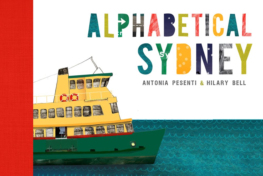
Hilary Bell tells of the genesis of vibrant picture book Alphabetical Sydney, a collaboration with architect and illustrator Antonia Pesenti.
Antonia and I met in 1995, overseas. Soon she moved to Paris and I to New York, but we stayed in touch through our peregrinations over the next decade. Every Christmas, a beautifully illustrated card, or calendar, or series of city illustrations would land in my mailbox from Ant, always fond depictions of some obscure urban detail (the sandstone arches of a railway station; street guttering). When we found ourselves home in Sydney again, with imported partners and young children, we had the shared experience of seeing our beloved, familiar city, the city of our childhoods, through fresh eyes.
Ant had been working on an idea for an illustrated book about Sydney, using the alphabet as its frame and structure. After seeing the initial illustrations , the concept struck a chord – we had a mutual story to tell, and this was a way to tell it that made sense to both of us.
We knew from the outset we wanted the book to appeal to both children and the ‘art’ market: our inherent styles lent themselves to this cross-referencing, being at once playful and sophisticated. As a playwright I have a love of language, and (imagining parents reading the book aloud), an awareness of how the spoken word differs from internal reading. Ant’s images are rich with layering, collage, photos and drawing, with a crispness and humour to them, and a sharp eye for detail.
The alphabet provided a structure that would allow us to roam freely around the city, highlighting its features both mundane and wondrous. We wanted to evoke a Sydney that was personal, somewhat nostalgic, and a far cry from the tourist-guide version. There are a couple of icons we couldn’t go past – the Harbour Bridge, Taronga Zoo – but we were keen to communicate a personal, specific view of the urban fabric that incorporated more than Bondi and The Rocks. We were struck by how strong the presence of nature is in the city: after a few letters we had to actively resist animals, birds and flowers and refocus on the built fabric of the city. We were also keen to show the city’s eclecticism – jasmine, ibises and delicatessens aren’t native, but what would Sydney be without them? We wanted to incorporate the west and south, buildings and roads, the beautiful and beautifully ugly – they all contribute to our sense of the city. Thus, L for Lawn Bowls and P for Parramatta Road.
Once we had established the tone – one that would appeal to children in its whimsy, to adults in its urbanity – it became clear what subjects were right or wrong (D is for Drag Queen didn’t make the cut), or when a line became too ironic – though ‘too disgusting’ wasn’t a problem (peeled-off sheets of sunburnt skin, anyone?). The subjects always referred to the city – the uniqueness of Sydney, and a sense of place.
The design of the book was paramount – we had always wanted it to be a beautiful object, with a carefully crafted format that feels both intimate and precious. The book opens and ends with a map of Sydney, one that starts at the coast and spreads towards the interior.
In the end it was 'A' that proved the most difficult letter – not to write or draw, though there were challenges for both of us here, but in terms of the subject. While we both loved ‘amenities block’ and ‘awnings’, they were neither grand and weighty nor introductory enough to grace the first page of the book. We tossed ideas around for months (years!), until we finally hit on ‘amusement park’: it allowed us to refer to Luna Park (obliquely in the text, directly in the illustration), and welcome the reader inside – through that toothy entrance as well as into the world of the book.
Five years in the making, we have finally finished ‘Alphabetical Sydney’. It was a proud moment when we received our first copy from the NewSouth office, and turned the pages as if we’d never seen it before. And happily, after only a tiny horns-locking moment on the letter Z, we are still friends – and talking about what to make together next.
Antonia Pesenti and Hilary Bell's picture book Alphabetical Sydney is published by NewSouth in October 2013.Follow the blog at alphabeticalsydney.tumblr.com
